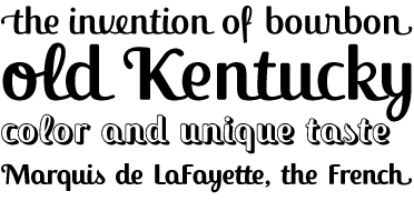
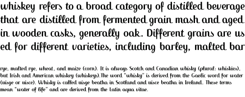
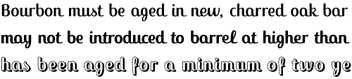
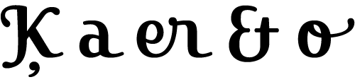
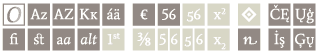
|  ackie is a dysplay type with a very good look a bigger sizes. It is inspired in the lettering of the word Tennesse from the Jack Daniels’ whiskey label. The idea was to design a contemporary script type with some kind of retro style. It is perfect for logos, labels and short text. ackie is a dysplay type with a very good look a bigger sizes. It is inspired in the lettering of the word Tennesse from the Jack Daniels’ whiskey label. The idea was to design a contemporary script type with some kind of retro style. It is perfect for logos, labels and short text.
|
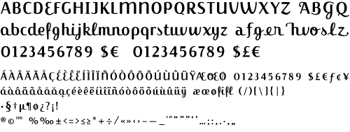
The family include swash capitals, ligatures,
alternate, initial, terminals and contextual glyphs. Jackie
came in three weights: regular, bold and block. . Published by FontFont International 2003. In 2008 it was redesigned to become a complete OTF Pro. |